The smaller you are, the more you need a big brand
Bethesda Heilungsdienst is the name of Daniel and Esther Baumgartner’s Zurich-based Christian counselling ministry. In recent years, their work has grown with a radio courses, international webinars and the book ‘Parents Empowered’. To unite the various aspects of the ministry they asked us for support with the development of a logo and branding.
Project
- Client: Bethesda Heilungsdienst
- Job: Logo design, corporate brand or corporate identity (CD/CI)
- SoundsWrite role: Brand consultant and designer

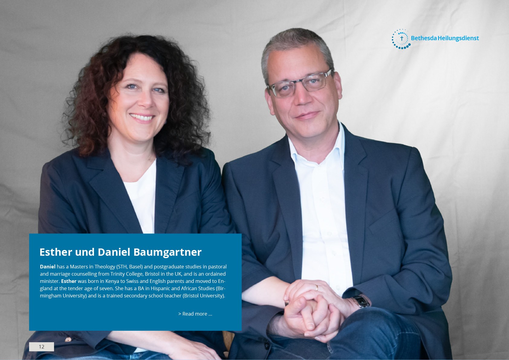
Impressions from the CD/CI manual created for Bethesda Heilungsdienst in Zurich.
Given the world-wide popularity of the name Bethesda, it was important to create a logo with a distinct Swiss feel that instills confidence in individual clients as well as conferring an air of authority on print publications and social media posts.
The power of a strong concept
A logo and classic stationary are nice to have, but nowadays, the smaller you are, the more important it is to have a strong understanding of who you are and what you want to say. Then you can focus all your limited resources on projecting a clear and consistent message.
Besides the logo we also developed a social media concept and equipped Bethesda with a system to efficiently generate social media graphics and to brief foreign publishers who develop language adaptations of their materials.

